
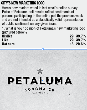
 Those responding to this week’s online poll were divided in their reactions to the city’s new marketing logo, pictured to the right.
About 40 percent said they disliked the logo, while 40 percent approved of it. Here were some of the comments.
——
“I guess I like the star and the font of Petaluma, but the Co. of Sonoma County looks funny; it looks unfinished. It looks like the name of a restaurant.”
——
“That’s all you got? That’s been on cheap tee shirts and hats for years. At least put a website or IP address on it….sheesh!”
——
“You have to be kidding, looks like a beer bottle label. With all the creative talent in Petaluma this is the best they could do?”
——
“It says absolutely nothing about Petaluma other than the county and state that we’re in. We’re a lot more than that. And a red star??? Gimme a break.”
——
“Simplicity is a good thing. A logo doesn’t need to tell an entire casino online story all by itself.”
——
“No chickens? No eggs? No agriculture? No wine? No way.”
——
“There should be a choice that says, ‘Loves!’”
——
“What is with the red star? Is that to represent all the socialist and communist that live here?”
——
“It’s nothing special, but I like the classic look of it.”
——
“What is the significance of the red star? What does that have to do with Petaluma? This looks a little bland for Petaluma. Keep the chicken!”
——
“The star does not suggest anything to me about the quality or character of our community. The clock tower does.”
——
We have a historic downtown that attracts tourists, and a river that we are developing as an ever more accessible asset for visitors and residents alike, and these enduring features can be symbolized in any number of ways to distinguish us from less people-scale settings. Why a star? It could be in outer space. We have a down-to-earth personable community.”
——
“Any child could have come up with this. Why did we pay $15,000 for this? How does this even represent Petaluma in any way? A star could be any city, any state.”
——
“Like we need another lawsuit such as stealing the Pellegrino Sparkling Water logo.”
——
——
“Represents our history and adds an appropriate touch of modernity. It is easy to see, read, reproduce in all media, and speaks to the county too and the country.”
——
“It’s woefully amateurish. Shows no imagination or creativity. It’s as Spartan as the inside of a Russian retail store under the USSR. Nothing scenic, nothing at all inviting. How very sad! We can do a lot better.”
——
Recent Comments